It’s About Time

One of the main settings that needs to be tended to in photography is shutter speed. When I first started shooting I didn’t really pay much attention to it because I thought it was a boring setting. I didn’t think that how fast the shutter was open effected anything outside of the lighting. Because of this I always left my camera on auto for the shutter, but I didn’t realize what I was missing out on.

The am learning more everyday about photography and how to have more control over how the pictures come out and turns out a big part of that is the shutter speed.

Shutter speed lets you control how motion is expressed in the photo. Whether that is through blur or through freezing movement is up to you.

STOP. DON’T MOVE.

A fast shutter speed is perfect for creating a frozen in time effect. And I know it sounds weird and it seems like every photo would freeze time, but with a fat shutter it is different.

IMG_6559

In the photo above for example you can see that the water is moving but there isn’t any motion blur. I used a 1/4000 shutter speed which is the highest my camera will go so I could get clear shot, because the shutter was at the fastest speed there want a lot of time for light to get to the sensor so I had to add my own light.

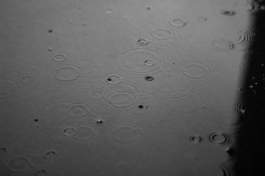
IMG_6462

I also used a 1/4000 shutter speed for this shot of a puddle that was full of rings from the rain.

Blurry Face.

On the other side of the spectrum if you use a long shutter speed you can add moment through blurs in the photos.

IMG_6599

For the picture above I used a 1/8 shutter speed so I could get the moment in the outside branches. Because it is such a slow shutter I set up my camera on a tripod to minimize blur, to add even more stability you can use a remote to click the shutter without touching the camera, but I don’t currently have a remote for my camera.

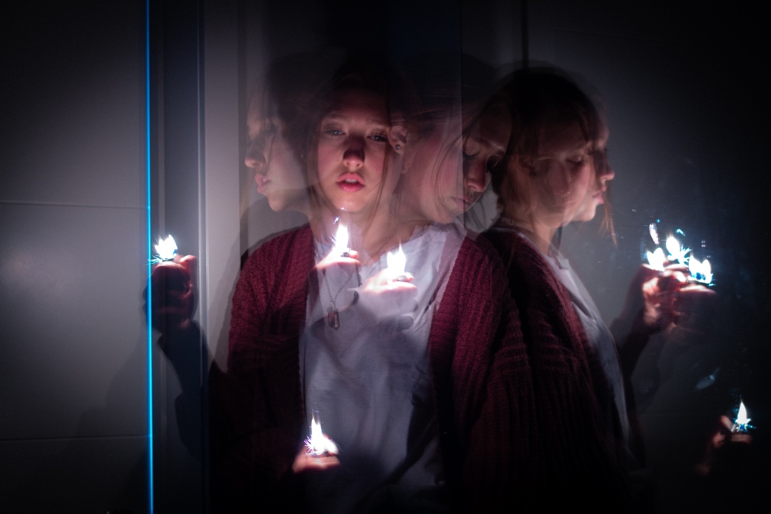
IMG_6395

This picture is easily my favorite. This was my first really long exposure shot because I finally got a tripod. The shutter speed was  30″ meaning the shutter was open for 30 seconds. The room was pitch black so I didn’t know how any of the shots would come out, but that was part of the fun. I set up the camera then hoped over the where it was aimed and would move around flipping a lighter on and off to catch different moments of the movements all in the same shot.

There is so much that can be done with the shutter besides just controlling the lighting and I am exited to keep exploring that!

What makes a good photo?

This week I learned about the elements that make a photo aesthetically pleasing. There are a lot of different things that determine how appealing to the eye a photo is, including light, exposer, detail, balance, etc.

This post is focused on the use of the rule of thirds, leading lines, and depth of field.


The Rule of Thirds

India Earls Photo

IMG_2320

All three of my professional photos are from a photographer I have followed and been obsessed with for years names India Earl. She has a very natural style that I love.

I liked her pictures even before understanding what made a photo great, but now that I know a few basic principals of photography I am seeing them repeatedly in her work.

I chose this photo because even though the people are very small in the frame they are still the focus of the shot. They are able to be more focal than the stunning background because of the rule of thirds.

IMG_2327.jpg

The grid above shows how the man perfectly lines up with the two thirds vertical marking on the photo and is also located on the meeting point of horizontal and  vertical markings, making them the focus over the beautiful New Zealand background.

IMG_2320-1.jpeg

As an added element this photo also uses depth of fields, using the natural layers to add variety and to keep the eye interested with new things to look at.

My Photo

IMG_2337

I took this picture of my brother using the elements from the New Zealand picture. It is a little different in perspective because of limited space and a phone camera that doesn’t always show great detail if the subject is far away.

I love the colors of the flowers and grass, and the golden light from taking the photo right before the sun went down.

IMG_2338.jpg

To replicate the effect of the New Zealand picture I lined the camera up so my brother was pretty close to a vertical line of thirds, and cropped the picture later in editing to get it even closer. This makes him the main focus of the photo even though the lilacs are stunning behind him.

IMG_2337-1.jpg

To replicate the use of depth of field I used a setting that had the three layers of the grass, the lilacs, and the sky to create different textures and add interest.


Leading Lines

India Earls Photo

IMG_2322

This photo is also and India Earl picture. Taken on a trail following a cliff on the Irish coast. I love all the green on the cliff and the grey blue of the sky and the sea. I chose this photo because the picture clearly points to the couple as the focal point because of the use of leading lines.

IMG_2322-2.jpg

This photo originally stood out to me as an example of leading lines because of the path leading up to the couple but after I looked at it closer I also noticed even the cliff edges are leading the eye to the couple making them a strong main focus of the photo.

This photo shows how using a path can be an easy way to incorporate leading lines into a photo, creating an actual path for the eye to follow.

My Photo

IMG_2335

Inspired by the path in the photo I when out to a small path through the woods with my brother to practice using leading lines. We took some pictures along the path but I liked this picture over the creek the best and thought it was the best example of leading lines.

IMG_2335-1.jpg

So much points my intended focal point in this picture and the bridge and path lead to him as well making the eyes path even easier to follow. I wish I could have fond a higher perspective that would have shown more of the path in front of him to increase the leading lines affect but overall I’m happy with it for a first time effort to intentionally use leading lines.


Depth of Field

India Earls Photo

IMG_2319

This final photo is again from India Earl. I love this photo because of the major differences between the different depth levels. There is so much contrast between the dark green and the grey/white background on the hiking path out to this glacier in Alaska.

IMG_2319-2.jpg

The three levels in this photo are the path and the greens where the focal point is, the ice glacier, and the mountain in the far background. These layers show the depth of the photos location and keep it from appearing  flat. It creates a nicer perspective and shows off the variety in the location for this shoot.

My Photo

IMG_2336

I took this photo out behind a park where the grass begins to grow long then the tree line into the woods starts. We went to take this picture on a cloudy day to give it a softer light and it resulted in a darker overall color to the picture. I liked the way the ground dropped off into a slope right after where my brother was sitting and hoped it would add a good depth to the photo.

IMG_2336-1.jpg

I blocked this picture into three main depths, including the grass, the trees, and the sky. I like the layering in the trees, but I wish I had found a way to incorporate a little more contrast into the frame and that it was a little less flat.

I like the layering of the grass in front and behind where he is sitting and the line of the yellow grass behind him.


Conclution

I loved being able to analyze the professional photos and get a better understanding of some of the basic rules of photography. I fell more comfortable being able to understand why a photo is good and being able to recreate a good photo.

I like the way my pictures turned out, but I also feel really aware of how much room for improve there is. I am excited to learn more and continue improving.

 

Making Words Pop with Typography

Screen Shot 2018-05-12 at 11.37.11 AM

This piece is from the LDS church featuring a quote from the Church of Jesus Christ of Latter Day Saints 2016 General Conference. It is a quote from Sister Bonnie L. Oscarson. I picked this piece because the 2 different fonts are very different but still go together and add emphases to certain words.


IMG_2261.jpg

I believe this is a sans serif font, at first I was a little confused in trying to identify it because of the organic look to the font, but I decided because the thickness transition is very small and because there is no serifs or stresses it is still a sans serif font.

It is used in two different places, first it is used for parts of the quote then for the speakers name. The two places have obviously different sizes and are separated by a good amount of space so it is clear the name is not part of the quote but the matching font creates a connection between the quote and the name, making it clear it is the name of the person who is being quoted.

IMG_2260.jpg

This script font adds a hand written feel to the two words it used on, and because of the very minimal use of this font compared to the other it draws attention to the words “rejoice” and “optimistic”. They follow the cheesecake rule in using this font sparingly and the font is easy to read because it was made bigger.


Conclusion 

The two contrasting fonts create variety to keep the eyes interested and add emphases to key words. The use of only two fonts through the whole page make it repetitive in a way that makes it clear all the text is related, but both fonts are very unique making it clear the difference was intentional. They also have a similarity in how organic they look, which I think makes them appear cohesive.


Sheffield Business School Analysis

Screen Shot 2018-05-04 at 9.48.41 PM.png

I choose this ad because it has a lot of contrast but is also pretty simple and incredibly easy to read. The ad is from 2005 for Sheffield Business School, I couldn’t find the designer. Another reason I liked it was because it is pretty minimalistic, but it conveys a clear message about the school.

Proximity 

IMG_2233.jpg

It is clear what goes together and there is an easy path for my eye to follow. The groups are mostly small with the main message of the ad being bigger than the rest. The small groups keep me from being bored or becoming overwhelmed by the amount of information on the page.


Alignment 

IMG_2233.jpg

It is left aligned it all bottoms out at the same place. This creates a strong line linking all of the different groups together. It also creates a lot of blank space for the eye to rest.


Repetition 

IMG_2233.jpg

Most of the text was the same color and fonts where repeated between a few different groups like the text in red circles. The bold text was repeated through the blue squared text even though the color changes to make it clear it still goes together. The speech bubbles graphics are all different shapes and sizes but the color and style is the same to make them consistent.


Contrast 

IMG_2233.jpg

One of the biggest contrasts is in the text style, the texts have differences in size and thickness that are obviously intentional. I think one of the most well done  contrasts in this ad is the “like sir” being a different color than all the other text. It makes it stand out from everything else which is effective because it is the main selling point of the ad. The other big point of contrast is the thought bubble graphics, I think this is effective because it breaks up the page and ads some extra variation to the ad keeping it from being plain.


Color 

IMG_2233.jpg

The ad has an overall warm color and all the colors are cohesive. All text is the same color except the stand out phrase and that even matches the mango color of the page but is just a darker shade. I think it could have used a little more variation and maybe a complimentary highlight somewhere in the ad to make it pop a little more.


Conclusion  

I think this ad is effective and draws the eye, but I also think it could have been better. It is a little plain and doesn’t really stand out as much as it could. That being said it uses a lot of really good elements that I didn’t even recognize until this week. It was easy to read and the meaning was clear.