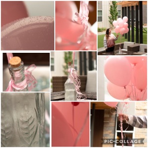
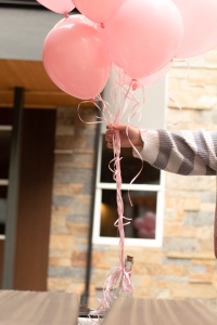
I knew going into this that I wanted the pictures to have one main color as the focus. I decided to go with balloons and a soft pink so I could tweak the other colors to have that same warm slightly pink tone.
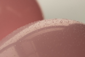

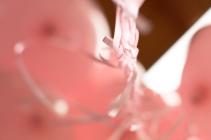
Getting a closer look on these two pictures above was really fun and an interesting perspective. Even though it is such an up close perspective you can still tell what it is and looking at the pictures I can almost smell the unique balloon scent that reminds me off childhood birthdays.
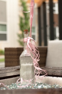
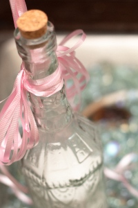
To go along with the balloons I tied them to a glass bottle full of white sand. I picked this to keep the colors other than the pink neutral.
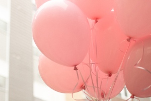
I edited them all almost exactly the same so they would all have the same shade of pink and they would all look even more cohesive.
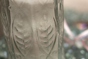
I loved getting pictures that showed the details on the bottle and the texture in the sand.
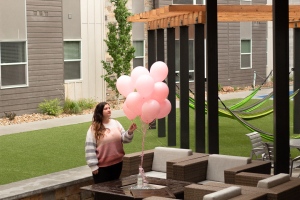
I made my roomate dress to match the balloons so it would create even another element of that same pink color.
All in all it was a fun practice and I can’t wait to plan more shoots like this!

I love contrast with the pink, green, wood and stone. You rocked it and made it work! Super interesting that you added that you can smell the balloon scent by looking at at the image, it gave it a whole new emotion! And to me photography should remind you of a some sort of emotion.
https://wordpress.com/read/feeds/79859247/posts/2285251634
https://samanthavanderwalkerphotography.wordpress.com
LikeLike